Earn £0.03 Chamber store credit with this order — join free
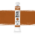
Abteilung 502 artist-grade oil paint (AKABT555)
For colour-mixing, glazing and rich violet accents
Supplied in an oil paint tube
Read moreRead less
Permanent Violet packs a real punch. It's a saturated tone that adds life and strength wherever you lay it, coming into its own worked over blue, turquoise or violet bases. Cut with a touch of white it softens into a gentle undertone for subtle degradation, so it swings from bold statement to whisper-quiet shading depending on how you handle it.
Best for
Working over blue, turquoise and violet bases
Saturated accents on gems and xenos skin
Softened undertones when mixed with white
Rich shadow tones in the cool spectrum
Build it up in thin glazes and it does genuinely striking things to a cool scheme — this is a colour that rewards a careful hand.
A saturated violet with real presence. Pair it with Cyan for cooler shading, and browse the wider Abteilung 502 oil range.
Order within — for same-day dispatchOrder before 3 pm (Mon–Fri) and we’ll ship it today.Order before 3 pm UK time (Mon–Fri) and we’ll ship it today.Order before 3 pm UK time (Mon–Fri) and we’ll ship it today.Order before 3 pm UK time (Mon–Fri) and we’ll ship it today.Order before 3 pm UK time (Mon–Fri) and we’ll ship it today.Order before 3 pm UK time (Mon–Fri) and we’ll ship it today.Order before 3 pm UK time (Mon–Fri) and we’ll ship it today.Order before 3 pm UK time (Mon–Fri) and we’ll ship it today.Order before 3 pm UK time (Mon–Fri) and we’ll ship it today.Order before 3 pm UK time (Mon–Fri) and we’ll ship it today.
Rated 4.94/5 from 865+ reviews
Same-Day DispatchSame-Day DispatchSame-Day DispatchSame-Day DispatchSame-Day DispatchSame-Day DispatchSame-Day DispatchSame-Day DispatchSame-Day DispatchSame-Day DispatchOrder by 3pm, weekdaysOrder by 3pm, weekdaysOrder by 3pm, weekdaysOrder by 3pm, weekdaysOrder by 3pm, weekdaysOrder by 3pm, weekdaysOrder by 3pm, weekdaysOrder by 3pm, weekdaysOrder by 3pm, weekdaysOrder by 3pm, weekdays
Free UK ShippingFree US ShippingFree ShippingFree ShippingFree EU ShippingFree EU ShippingFree EU ShippingFree EU ShippingInternational ShippingInternational ShippingOn orders over £65Over $150 · duties & taxes inc.Over US$150 · duties & taxes inc.Over US$150 · duties & taxes inc.Over €100 · duties & taxes inc.Over €100 · duties & taxes inc.Over €100 · duties & taxes inc.Over €100 · duties & taxes inc.Calculated at checkoutCalculated at checkout